TU Dublin is a different kind of university. We are not limited by old-school thinking. We’re not linear. We’re lateral. We’re not about fitting in. We’re about making an impact.
Our visual identity communicates this spirit of change. It is confident and bold. A bit of a trailblazer. It has been carefully crafted. It expresses the potential of the University and of our students to make a difference - not just to Dublin or Ireland, but to the world. The possibilities are infinite.
Our primary typeface is Prophet and we use it to express our personality in a bold statement.
Visuelt is our supporting font family. A warm, geometric sans serif that ensures our communications are clear, legible and confident. It comes in a variety of weights, allowing flexibility while maintaining a consistent visual identity.
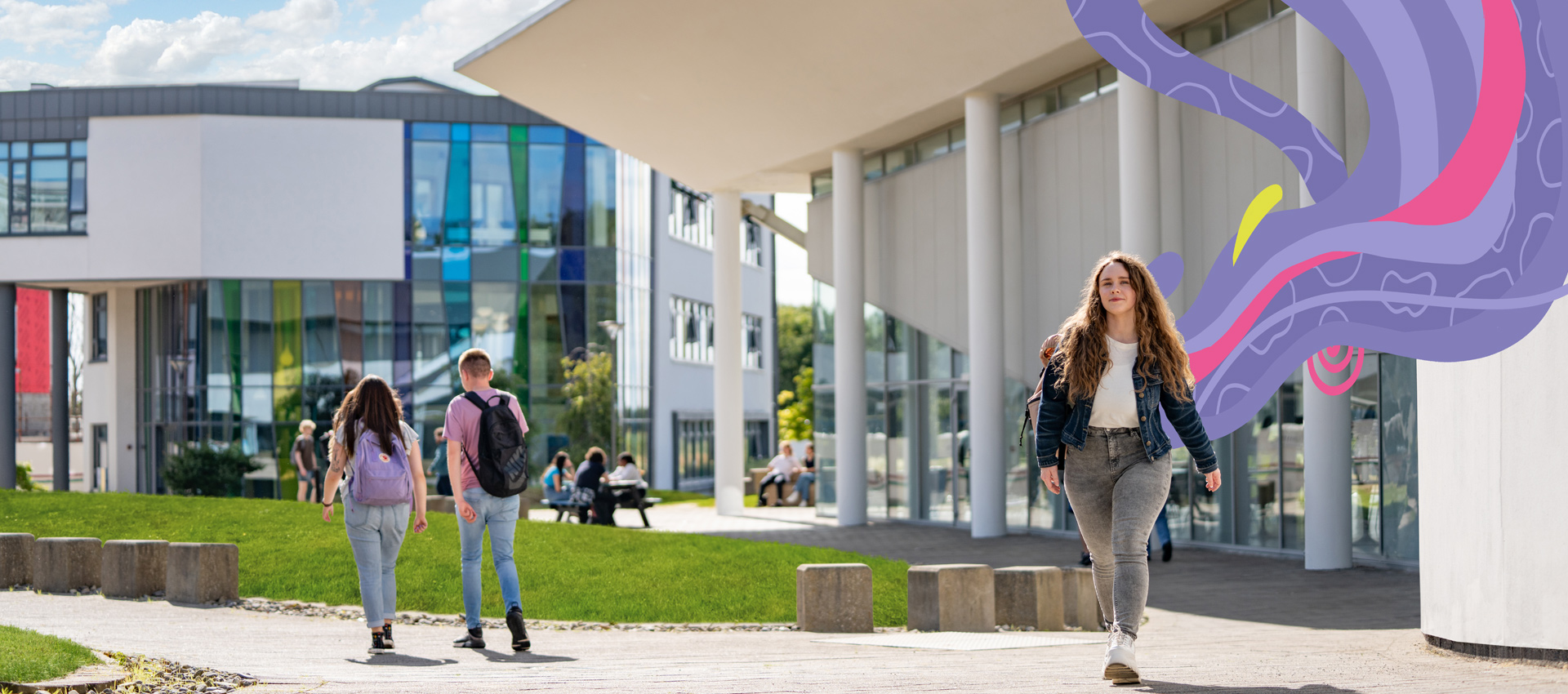
Our T-graphic is used as an identifier in our designs – sometimes in the background, sometimes partially visible.
We’ve created a TU Dublin Brand Book and Logo kit to provide you with more details and guidelines about our visual identity. It contains digital versions of the TU Dublin logo, along with our brand book which provides examples of our brand in action.
If you have any additional requirements, please email us at brand@tudublin.ie